We’re back with a major update! This time, it’s a 100% design update, and you’re going to really like it, especially if you’re a mobile user! Read on to learn what’s new in Ninchanese.

In this update, the focus was on design to improve your user experience learning Chinese, as that’s always one of our priorities. This design update also is a big step toward getting Ninchanese ready for its release on mobile devices. Here’s what’s new in this design update.
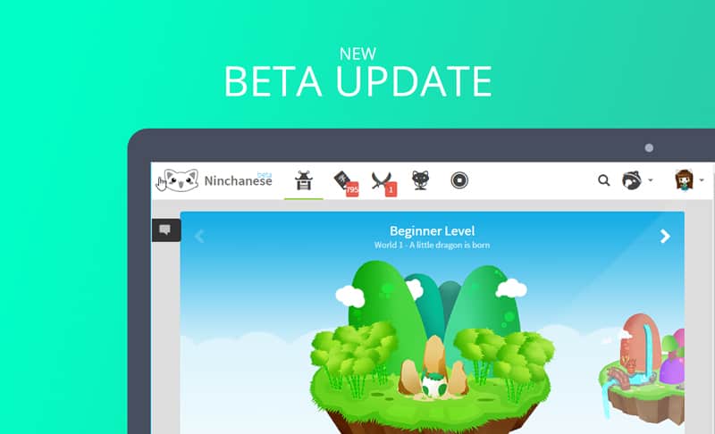
A new and improved selection screen
Ninchanese currently offers Chinese content for levels ranging from complete beginner to advanced. However, it appeared that this wide range of content and learning material wasn’t visible enough to some users, who tended to stick to the beginner area and not notice they could skip ahead to material that suited their level of Chinese better.
So, to make the different levels in Ninchanese more visible and more easily accessible, we’ve completely redesigned the world selection area. Now all islands are visible, so you can click on them or slide the islands until you find the world that suits you.
Each world corresponds to a specific level of Ninchanese: World 1 is for newbies in Chinese, i.e., complete beginners in Chinese, World 2 is for elementary Chinese learners, World 3 is for intermediate Chinese learners, and World 4 is for upper-intermediate Mandarin Chinese learners. In addition, we also launched advanced Chinese courses, which are World 5 and 6 of Ninchanese.
Plus, we think it looks prettier, and we think you will too.
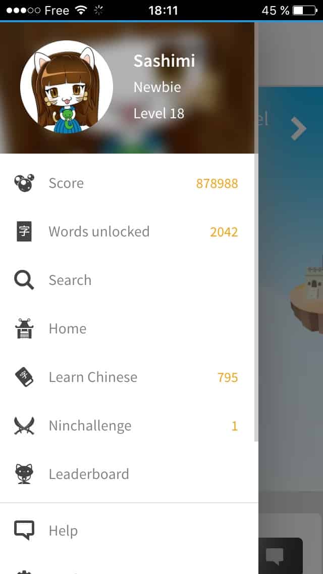
A new menu
The left-hand menu in the app was also completely redesigned to be easier to use on mobile devices and to allow you to navigate Ninchanese more easily. This is what it looks like now:

We are paving the way for Ninchanese’s first Mobile App!
We have also gone over most of the pages in Ninchanese to make your browsing experience smoother and more pleasant, especially on mobile devices, such as phones and tablets. There’s still some work needed for some pages, but don’t worry, we’re on it.
Our goal is to go over the pages in Ninchanese and reduce the loading time of the app’s pages. So now, you’ll have a more fluid and generally faster experience learning on Ninchanese, especially when you’re using a mobile device.
Even better yet! This design update paves the way for Ninchanese’s first mobile app,
What else is new in this design update?
The password reset page has been redesigned. You can now reset your password in style! We’ve also fixed and squashed bugs, as we always do. You guys are excellent at spotting and reporting bugs, and we thank you for that!
We regularly update some aspects of Ninchanese and improve the way your Chinese learning application works. Because we do that pretty regularly, sometimes we don’t write a blog post detailing the changes at the time. But plenty has changed since the last update, which added a whole Chinese-English and English-Chinese dictionary to Ninchanese! Things such as:

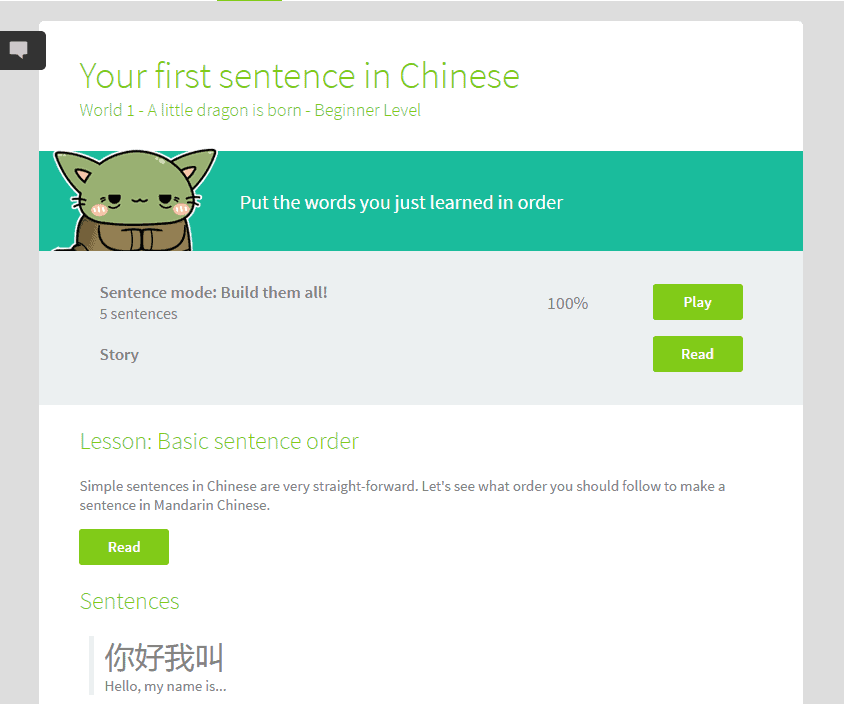
- Easier access to more information on a stage – now, when you start a new stage, have you noticed you can:
- Click on See More to see more details on the stage’s content. You’ll be able to see the list of words you’ll be learning or the list of sentences you’ll be learning to put together, speak or understand
- Read and reread the story as much as you want? Just click on the Read Story button
- View the lesson, if you’re doing a sentence-building stage with Yocha
- No more “to” – A number of you had told us via feedback and through the Nincha Chat on Slack that having to systematically type “to” before a verb was annoying and counter-productive. So we listened, and no made typing the “to” noncompulsory. So if you want to type “to be called” or ” be called” for 叫, you now can! We’re always happy to make changes, no matter how small, to make your learning experience on Ninchanese more pleasant and intuitive.
How do you like the new changes? We love hearing what you think, like, or believe could be improved, so let us know, either in the app or via the Chat!
See you soon for a new update!
Sarah, a meowsome member of:
The Nincha Team
Stay in touch with us on Facebook, Twitter, Instagram, and Pinterest.


